Summary
It’s not typical to start with a summary. But most likely you are here because you own Logos 7 or 8 and you want to gauge whether Logos 9 is worth the investment. So I’ll start with a survey of the main things you’ll get in order of my personal excitement. If you care to get more details, these are also the main headings below.
- Much-improved integration and deep linking between resources. What this means in non-nerd speak is that as you study you’ll be naturally pointed to texts and resources you want to know about or consider. It’ll also be far easier to get there.
- Dark mode looks FABULOUS, though it’s not quite working yet everywhere. The bugs will be worked out over time.
- Vastly Expanded Passage Gudies and Factbook make these a new starting off point for exegesis. And the live-updated information is well-curated.
- Updates to interactives and various modules are spread throughout the update but they are real and quite significant.
- A solid update to mobile and web apps. I dream of doing my full exegesis on iPad OS—that’s still a long way off. But we now have full Passage Guides and Factbook on the iPad—a big jump.
Conclusion: If you own Logos 7, you should definitely upgrade—the speed bump alone last year was well worth it. If you own 8 and need to pinch pennies, you could skip this cycle, but if you use Logos regularly it is worth the investment.1
If you purchase through this affiliate link you will also get an exculsive discount (and in the interests of full-disclosure, it will also be a help to me!)
Much Improved Integration
I once complained that Logos 7 felt like a chimeric monster comprised of vestigial features accumulated over the decades. In Logos 8, the hedges got trimmed and things made more sense. Logos 9 now feels quite sensible.
But there’s far more here. Logos marketing has always argued that the more resources you own, the more powerful the app becomes because everything ties together. This is the year that marketing feels realistic. Both the Passage Guide and the Factbook have expanded significantly. Type a passage in the key search bar and you’re immediately given a nice, sensible layout.
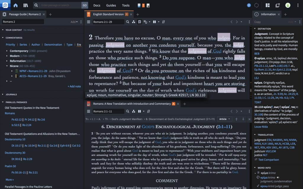
You’ll also find the the search bar feels more comprehensive and intuitive, as if Google started studying the Bible. Type in either a passage or a topic and you generally end up where you wanted to be.
The links and integration are impressive not just by overwhelming you (that was Logos 8!) but by being genuinely useful—as though they were chosen by actual people who study their Bibles daily using Logos. And this deeper integration stretches across the app. More than once I had an exegetical idea or something I wished to pursue further… and found exactly that link presented to me only a click or two away.
Dark Mode
Dark mode is a total relief. I went all in on dark mode a year ago; I didn’t even realize until now that I had an unconscious annoyance with Logos every time I opened it because it blinded me. The first time I opened Logos 9 in dark mode, the word “beautiful” involuntarily came out of my mouth.
Alas, there are a handful of places where dark mode is still being rolled out, such as the new memorization feature. Logos is a huge, complex app and the broken modules are few and far between. I’ve seen multiple modules fixed within just the week I’ve been using Logos 9 and this will be working app-wide soon. And in any case, you have to look for a long time to find non-working modules.
Related, Logos gave us a full-screen and reading mode that lets you truly max out your screen and other layout tweaks. Since Logos on Mac OS never fit the traditional Mac OS menubar anyway, it makes a huge difference on my ability to maximize my limited screen real-estate and feels quite immersive. This is also matched by a number of interface tweaks that use space far better.
Updates to Interactives
Of course, there are several plausible options for Bible software (though fewer with time!)2 if you hope to do grammatical searches, compare translations, scroll commentaries in parallel and other core features. But Logos has the deep pockets to continually invest in bespoke content that often requires backbreaking amounts of human tagging. For instance, a person search for “Joshua” will give the obvious results but also less obvious passages that I would otherwise miss such as Numb 13:8 (“Hoshea”), Num. 27:16 (“appoint a man”) or Neh. 8:17 (“Jeshua”). These investments are the Crown Jewels of Logos because they are like Netflix exclusives—you can’t get this content any other way. And Logos is so far ahead of the nearest competitor, the others can’t catch up.
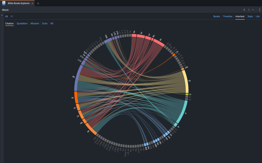
One place this shines is in the interactive modules and many of these have been improved in Logos 9. The feature that gets me opening Logos most often is its New Testament use of the Old. But take a look at the new Bible Books Explorer. This is not just mere pretty paint and chrome. The visual layout legitimately helps you perceive information you wouldn’t have otherwise grasped. And if you’re a teacher, it’s dynamite.
For instance, the intertextuality display lets you immediately grasp how strong connections are between books. I only wish I had access to this feature last year when I taught on intertextuality.
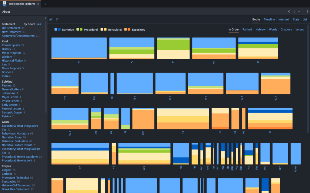
The books explorer also lets you visually grasp the genre makeup or content of biblical books or sort them by that content.
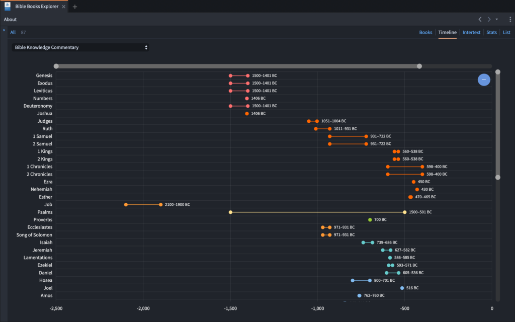
The Biblical Books timeline lets you see authorship dates across the canon—but significantly, you can change this view to display the suggested dates of 10 different major sources. This will be a critically helpful tool for me when I teach New Testament Theology later this year.
Mobile and Web Updates
I gripe every year that Logos is the gummiest app on my 2018 MacBook Pro. Logos 8 was a huge step in the right direction—everything felt a lot zipper. I lost patience for laggy software back when the President’s initials were BHO; these days I want my machines to give me information as quickly as I can process it. Unfortunately Logos does keep me waiting still. And so for sake of speed I often reach for my far zippier iPad Pro.
The good news is that Logos for mobile is gradually becoming more of a full-bodied research app. The expanded Factbook and Passage Guides are now on Mobile. This is truly powerful. I can do legitimate exegetical work sitting comfortably on my couch or with a few spare minutes in a coffee shop. And since my iPad is far zippier than Logos on the desktop, it might actually might be a quicker way to work too.
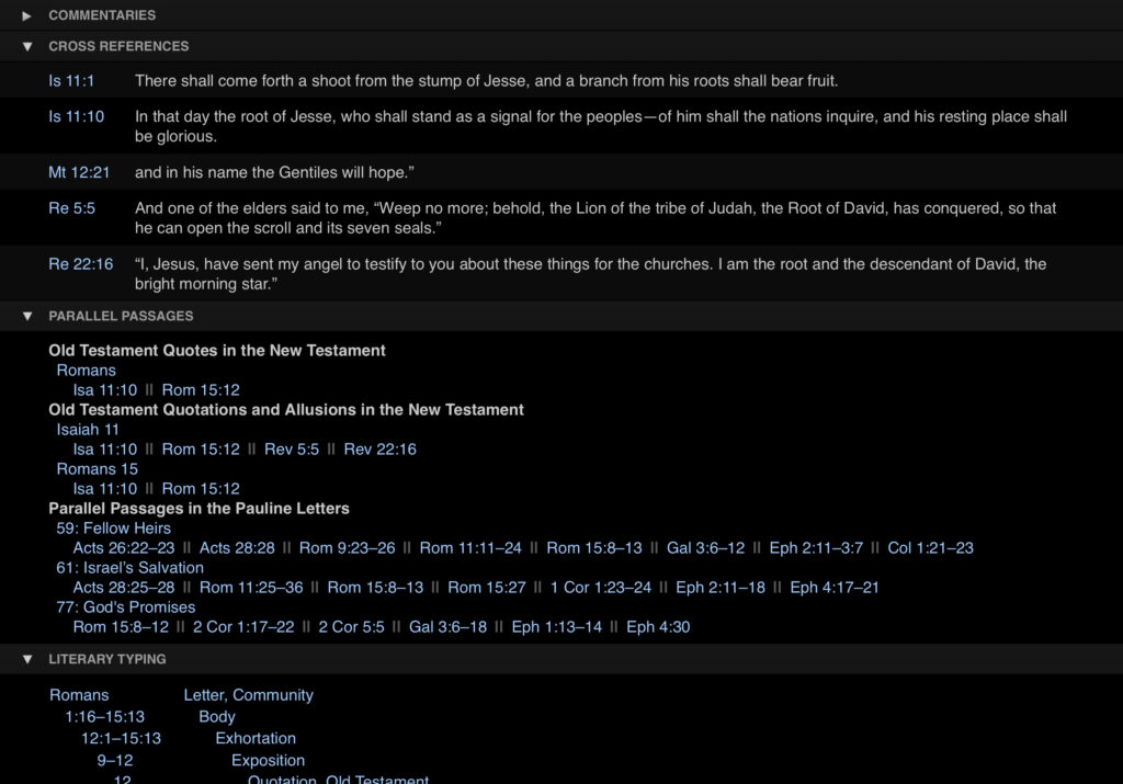
Besides this, mobile now lets you sync your sermons from the sermon builder in a nice speaking view. You can also create daily reading plans for the Bible or for specific books which is helpful since realistically, I won’t sit down to relax-read a book on my computer anyway. I also appreciate that when reading on mobile the toolbars and other distractions clear away and I can enjoy an entirely full-screen view of the text alone.
Feature that Matter Less to Me
This year’s update is also heavily focused on new sermon and counseling modules.
- Counseling Module: The content here is good and it could be useful information for personal education outside of a counseling situation. I just don’t see myself using the module in actual interactions. It seems far too unrealistic and impersonal to pull out my Logos module and start reading off questions. The content is also less useful to me because I minister cross-culturally (different categories; different needs) and have very strong theological pre-commitments on counseling. Still, this might be useful for teaching a class on counseling, for instance.
- Sermon Builder and Manager: Logos continues to broaden this tool. The new sermon manager helps you better track series and schedules. The advantage here is that you can write once and quickly have formats for handouts, slides and even a preaching view. The sermon manager will let you quickly sort sermons by text, topic, series, venue or date. And your content even appears in searches across the app. Even so it’s a non-starter for me because I can’t write in Markdown or even import from Markdown. And though the presentation creator is nice, I’m allergic to deadhead PowerPoints that duplicate my outline. It simply doesn’t fit my communication style. I’ll stick with outside apps for now.
Other Details
- A relatively minor feature is a very big deal for me—a new way to order by era. This will make it more likely that I click through history of interpretations in my study, simply because it’s there, clear, and ready to use. Though a small change, this is a big deal.
- You can use Logos to memorize Scripture by creating a verse list and choosing “memorize.”
- I really like that entering a simple reference into the main search panel opens a complete layout with the passage, the passage guide and a main commentary. It’s a great time saver.
- You will encounter bugs from time to time. Sometimes my mouse tracked in odd ways,2 some interactive were clumsy to navigate,3
My Wish List
No review would be complete without the things I’d love to see someday. Here’s a wishlist.
Speed
As I mentioned, Logos 8 already sped things up significantly; my intuition is that 9 is better still. Even so, gumminess is easily the biggest reason I chose not to open Logos. Why do I hear about people opting to use Logos on the web instead of the native app? So they can work more quickly!?! Beloved, these things ought not to be.
At the same time, I do get what’s happening here. This is a huge, sprawling app. What’s actually making my machine sweat is not the text but all of the graphic prettiness behind the interface. And I’m grateful for the progress that has already happened. I’ll just make another vote for continued progress on efficiency.
Url schemes
Another item major wishlist item is deep linking. A certain competing software vender lets me run complex searches from a link. I use this constantly in teaching and preaching to show my listeners verse lists or repeated patterns across Scripture. I can do some very basic location linking but can’t get close to this yet in Logos.
Interactives and Features on Mobile
I read and work more often from my iPad than my desktop and I teach and preach entirely from my iPad. And yet… many of my favorite features of Logos 8 are not supported on iPad OS. Not infrequently I find myself sitting on the couch, exploring, learning… and then I’m stuck in the middle of a workflow just because I’m on my iPad and it doesn’t support a critical feature. I would love to access the Bible Books Explorer or the New Testament to Old Testament module on iPad. Another big one is that while you can view sermon builder on the iPad you can’t actually write them or edit. That actually kills the sermon builder for me since I am often editing, adjusting, tweaking right up until my speaking time.
That’s it for now. I’ll keep on digging into Logos 9 over the next few days and expanding this review. Ask me a question in the comments, I’ll research it and add it to the review!
- In the interests of full–disclosure, I did receive a review copy of Logos 9 as part of this review, for which I am grateful. ↩
- Bibleworks closed permanently two years ago; this year Wordsearch also closed. Today, the closest competitor is Accordance. ↩
- I found it very difficult to navigate the narrative character maps—Acts Part 1, for instance. ↩


Which package was the basis for this review?
I’m not sure the performance issues are primarily related to graphics, though.
– The biggest performance impact comes from reindexing the collection when new resources are added… hence the benefits that accrue when you switch from a traditional mechanical hard drive to a solid state drive.
– The other thing is ensuring you have a decent amount of system RAM. Logos does require a varying (and high) amount of that while running, depending on how many resources you have open. It’s like a web browser in that respect. There’s a memory impact if you have 100 tabs open in Chrome, for example. By design, Logos opens up a lot of tabs on startup. That’s how it’s designed to be used, the whole point is to have multiple resources open at once and to open more as you go.
– Any modern CPU should do the job there, but newer ones will of course often do better than old ones. If you have the disposable income to purchase Logos, you’ve probably already spent some of that on a device with an adequate CPU.
Great points. Thanks for the helpful feedback.
I was reviewing Logos Gold. I’m running an SSD with 8GB of RAM. Interesting analogy with the web browser comparison. That’s helpful info too—just to pay attention and close out tabs I’m not using.
I heard someone say that at least on Mac OS there was some kind of emulation layer involved. I don’t know if that’s true or not and I’m not nerdy enough to research it myself.
Fair enough on the indexing issue. I do notice that it’s much better when updates are finished downloading and reindexing is wrapped up.
One reason I tend to recommend Accordance to my friends here in the developing world is that they typically can’t be on top of the development cycle with SSDs, RAM etc. And of course just because Logos is costly. I am grateful that Accordance has created some really great packages particularly for the developing world and I would love to see Logos offer something like that also.
Yes, Logos is just a costly system to own and operate. No way around that!
I still haven’t gotten Accordance, but probably will someday. Especially if my copy of BibleWorks ever stops working. Accordance feels like more bang for your buck.
I think the biggest and most important improvement Logos could make would be to come up with a more competitive way of packaging content. Many people could use the power features, but can’t justify the cost. There seems to be a lot of bloat in the big packages still, and of course they need some way to justify the expense of those packages to justify the overhead involved in production. I don’t know how to fix the problem… except to point out that the majority of people in the target market (ministry professionals) are not your typical cash-flush SaaS customers.
I hate dark mode in any app. Just for the record. Hate it, hate it, hate it.
Now that I’ve got that out, may I suggest the annual subscription Logos Now? That way you stay current with the program and the latest features.
What’s your view on cost-effectiveness over time, using Logos Now vs just doing annual updates? For myself, I could see a pretty good argument for just taking the hit once a year…
Hi Joel, well with Logos Now, you are just keeping the main program current. You aren’t re-upping your “package” which usually changes every year also. I think I got a “Baptist Gold” a few years ago, haven’t done anything to upgrade it. I pick up the odd book here and there as I need it, but I think they don’t add enough to any particular package to justify renewing it each year. They also change the packages, so they never are the same anyway, it seems.
I may eventually have to upgrade the books if enough changes happen to the basic version to make new features not work on older versions of books, but so far that hasn’t been an issue.
Do you use the sermon builder? It seems pretty limited as a word processing system. (Is it even possible to search the text of the sermon you’re writing?) I would be interested if you had any suggestions on the best way to use this particular tool. Thanks!
Bluntly, I don’t use it. I use Drafts which is a simple but powerful markdown editor. It’s the perfect medium for writing and I preach from it also. Love it.
But no, the sermon builder would be way to simple for my purposes.